RMDY APP
DIGITAL HEALTH MADE SIMPLE
RMDY is a digital Therapeutics platform that supports long-term condition management, as well as short-term specialty care between patient and clinicians. RMDY is a mobile app that connects patients with their is supported by a web platform
OVERVIEW
The goal behind RMDY is to allow health coaches to properly monitor their patients with health markers
WISHBOX
YOUR VIRTUAL CONCIERGE
Wishbox is a personal virtual concierge that was created for the use of holiday
apartment visitors. It is a one of a kind on-demand platform from which users can order a variety of services right up to their doorsteps, much like what they may have been able to do from concierge services offered at top hotels.
My Role
I was solely responsible for the UI/UX of the product. I had to think, research and come up with both the UX and UI design concepts and implement them. I provided end-to-end high level designs designs on all materials, performed usability testing and worked closely with the Product managers, R&D teams as well as with stakeholders.
The Process
Coming into Wishbox, there was already an existing product, developed by outsourced teams. After the founders decided to hire a whole new in-house team, we started afresh. Having learned from the mistakes of the previous version, we created new user flows and use cases, researched trending designs relevant to the Travel and Hospitality markets and began developing a new and improved product.

HOME PAGE
This is the main menu and first screen which the user sees once entering the app. This menu offers a variety of services labeled by text and grouped by color into categories of similarly themed services.
WISHBOX
YOUR VIRTUAL CONCIERGE
Wishbox is a personal virtual concierge that was created for the use of holiday
apartment visitors. It is a one of a kind on-demand platform from which users can order a variety of services right up to their doorsteps, much like what they may have been able to do from concierge services offered at top hotels.
My Role
I was solely responsible for the UI/UX of the product. I had to think, research and come up with both the UX and UI design concepts and implement them. I provided end-to-end high level designs designs on all materials, performed usability testing and worked closely with the Product managers, R&D teams as well as with stakeholders.
The Process
Coming into Wishbox, there was already an existing product, developed by outsourced teams. After the founders decided to hire a whole new in-house team, we started afresh. Having learned from the mistakes of the previous version, we created new user flows and use cases, researched trending designs relevant to the Travel and Hospitality markets and began developing a new and improved product.
HOME PAGE
This is the main menu and first screen which the user sees once entering the app. This menu offers a variety of services labeled by text and grouped by color into categories of similarly themed services.
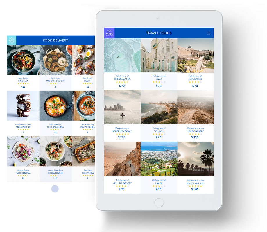
INNER MENUS
After entering one of the one of the services on the home page, the user reaches the inner menu of each category that offers many different options for services such as travel tours, food delivery, attractions, etc.
PRODUCT PAGES
After selecting a category and a service, the user reaches the service/product page from which information on that particular product can be seen. This is where the user can continue to make an order/purchase.

ONBOARDING
These screens provide a quick run-through to a first-time user of how the app works.

ICON STYLE
The style was kept minimal so to not overwhelm the already rich visual content used throughout the app.
PALETTE & FONTS
Although the color palette was minimal as well, strong vibrant hues were chosen for the main menu and accents throughout the app.

CHECKOUT
These screens show the checkout process using forms, calendars as well as other such elements that vary depending on the requirements of each service.

